How to get from this to this!!
I get a lot of questions about processing images, so decided to write a couple of journal articles which detail the exact steps I follow for a particular image. Each article will focus on a single image and illustrate the process I follow with a series of screen shots and commentary explaining why I did what I did. Firstly, some general comments on my usual process. I very much prefer spending my time behind a lens rather than a computer screen so my processing is usually quite minimal. Most of my images have overall exposure, sharpening and contrast adjustments, many have selective area exposure, sharpening and contrast adjustments and a few have minor distracting elements removed and saturation adjustments.
I do not use photoshop mainly because I don't know how to. I have the software on my computer and own several thick technical books on the topic but just haven't had the time or inclination to learn the program. I have had photoshop adjustments made to a few of my images (probably about ten in three years) by a commercial online image editing service called Tucia. I use Lightroom 5 for all my processing and to file and categorise my images so I can easily find them. It is an extremely user friendly, versatile program which does everything I need post capture. I am a self taught Lightroom user and consequently, am sure the way I do things may not be the easiest, best or most efficient, it is just the way I have learned.
The purpose of these articles is simply to show what is possible with a little basic knowledge of the program and some time to experiment. For a more in depth and technical understanding there is a huge amount of information available on the web, professional courses and many good books out there. One of my favourite wildlife photographers, Greg Basco, who lives and works in Costa Rica has recently written and E Book called 'Lightroom for the Nature Photographer'. It looks extremely relevant to my work, so I purchased this one today and hopefully will be learning heaps of new Lightroom stuff over the next few weeks. Here is the link if you want to check it out.
In this article, I have deliberately chosen a photo where the settings at capture were less than perfect resulting in an image that would probably be discarded at first glance. It is always worth experimenting with processing to see if a poor image can be rescued, particularly, if it captures something rare or beautiful. Hopefully this article is a helpful illustration of that process.
The Original Image
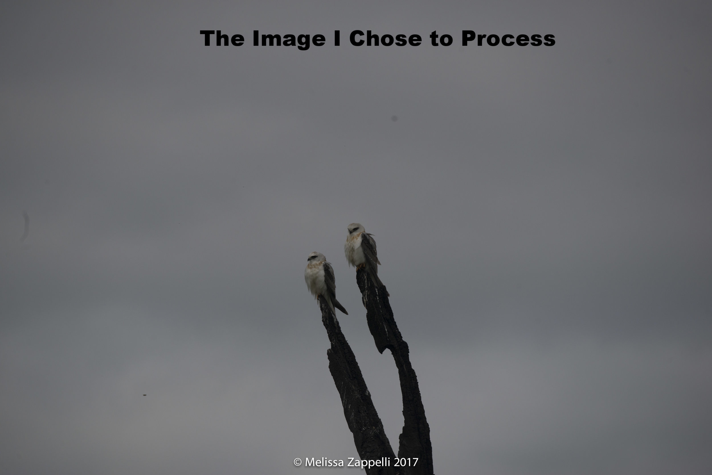
A pair of juvenile Black shouldered Kites, photographed on a very dark overcast day. I had been following these youngsters for over a month. They lived in a wet soggy paddock over an hours drive from home and had proved themselves to be quite elusive. I caught a glimpse here and there and captured a few images but nothing that did the beauty of these babies justice. So, this was a rare opportunity!!! Two juvenile Black Shouldered Kites sitting side by side on adjoining branches in the middle of the water logged paddock. Unfortunately, the light was terrible and I was quite a long way off. I followed my usual technique and slowly moved closer, averting my eyes and feigning disinterest. It took a long time for me to get anywhere near close enough for a good image, but I was lucky they stayed put. In situation like this I will take a few shots every few metres. That way if a bird takes off I have at least captured something. In this case I didn't get as close as I would have liked, and the sun didn't come out before they flew to another tree, landing high up and obscured and I didn't capture the takeoff shot that I wanted. I spent a few more hours hoping for more shots but didn't get another opportunity. My images were horribly underexposed and too far off, but they captured something I have rarely seen. Two beautiful juveniles, sitting close together, in the same frame, in a nice composition.
1. Shooting - I Always Shoot in Raw
I always shoot in RAW (NEF) format rather than JPG. RAW files contain all the image data captured, while JPG and other formats undergo a degree of data compression, where some information is lost. Consequently, RAW files produce a better quality final image and allow for a far broader range of processing adjustments. Image problems resulting from less than optimal settings at shooting can often be corrected in RAW files, while the same image shot in JPG would be unrecoverable. The disadvantage of RAW files is that they are much larger than JPGs and consequently take up a lot more space. I get around this issue by using large external hard drives to store my images.
2. Import Images into Lightroom & Select One to Work On
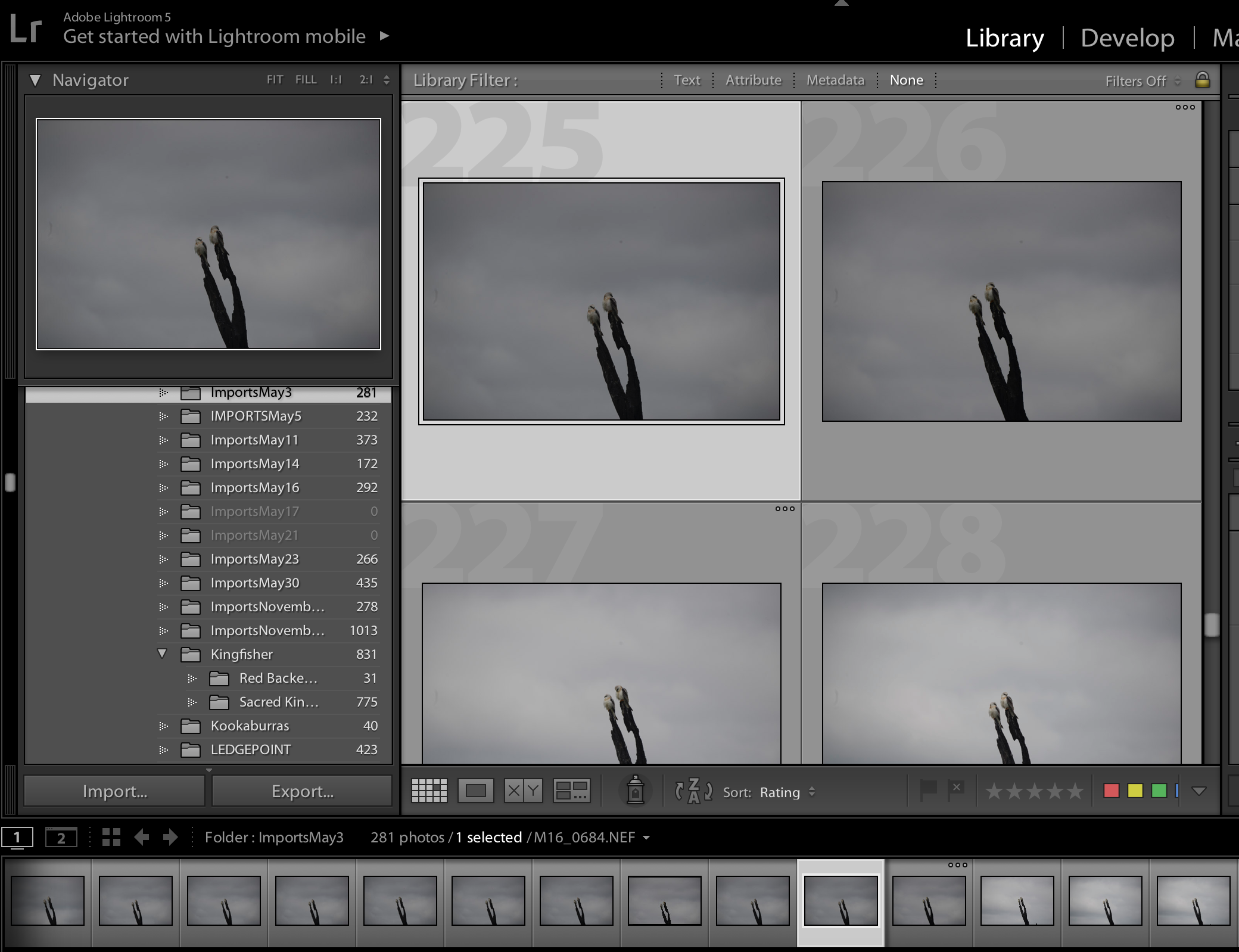
The first step in processing from a situation like this is to import the images from the day and look over them. Decide if it is worth trying to salvage something. In this case it was because it is so rare to capture two birds perched side by side like this. I had invested a lot of time trying to capture these guys and I wasn't sure I would get another opportunity. The next step is to select an image to work on from all those that I had taken. I find it is very important to be able to see the eyes of my subjects. When there are two or more birds in an image, the positioning and angle of the faces relative to each other is also important. In selecting my image I concentrate on these two points by zooming in closely on their faces, and eventually choose the image below, mostly because I think I will be able to retrieve a reasonable eye out of the shadow and darkness.
3. Initial Crop of the Image
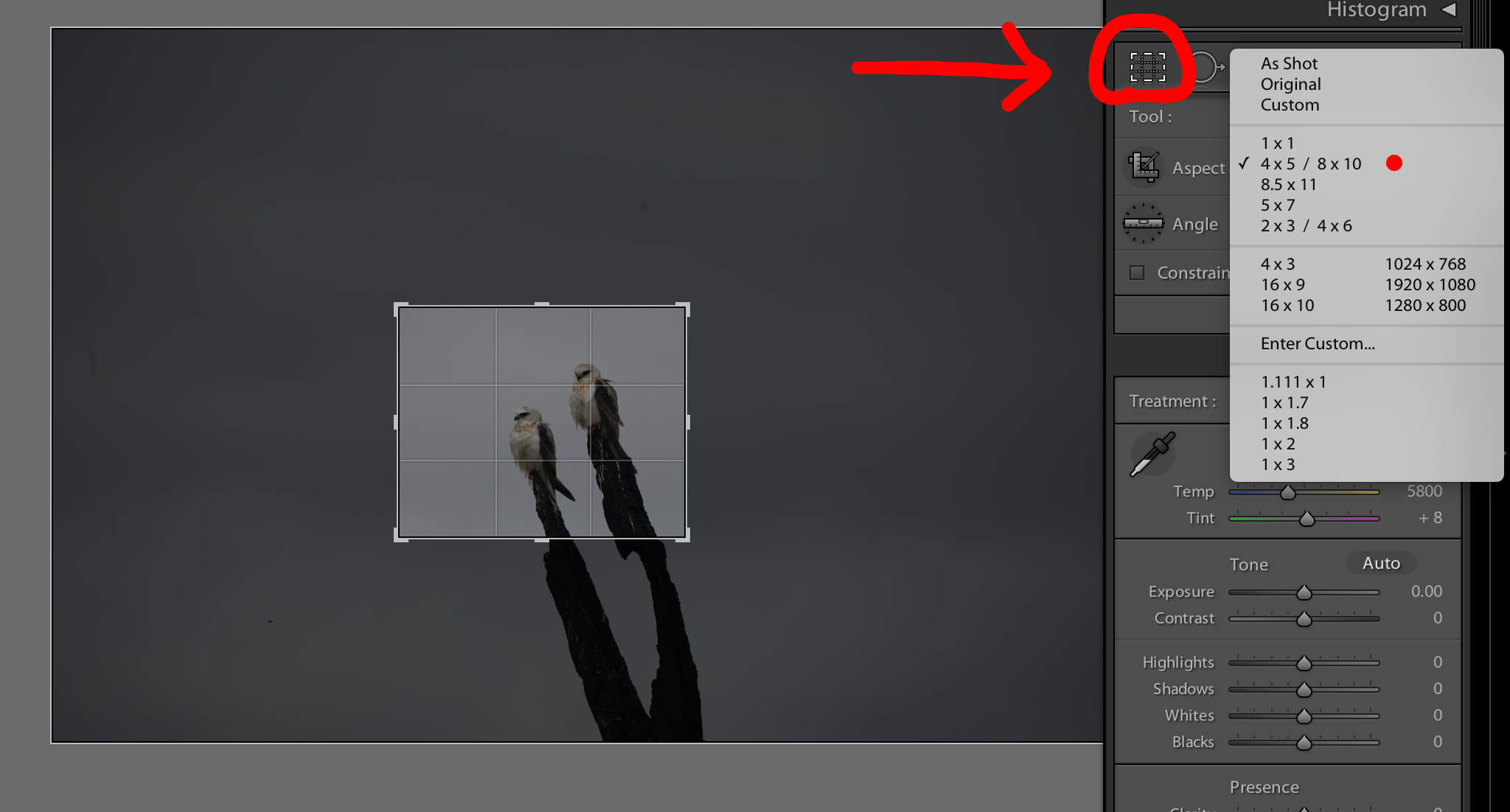
I crop the image to bring up the detail on screen so I can work on it more easily. I usually do a final crop as the last step in my entire process so the purpose of this crop is simply to be able to see the detail more clearly. At this stage I don’t worry too much about composition but I will have a bit of a play with different aspect ratios to get an idea of what looks best. In this case I decided on a 4*6 aspect ratio. I prefer to have quite a bit of empty space in my images. To me space can be very effective in drawing your eye to the subject and will often create a more relaxing feel to an image. All quite subjective of course. Below are a few examples of different aspect ratios and crops, something I will review and decide on at the final stage of processing.
4*6 Aspect Ratio - Decided to go with this one for now - the top bird’s head can be positioned close to the intersection of thirds creating a nice composition and there is lots of negative space to the left which I really like.
1*1 Aspect Ratio (Square) - I like this as well. The top birds face can be positioned over the intersection of thirds, it is tighter and closer composition but it has a nice feel so could be an alternative.
8*10 Aspect Ratio - Also good - as with the other two options the top bird’s face can be positioned over the intersection of thirds, it has a little less negative space than the 4*6 crop but the wider rectangle suits the positioning of the two birds and creates a feeling of height. Another alternative.
4. Adjust Exposure
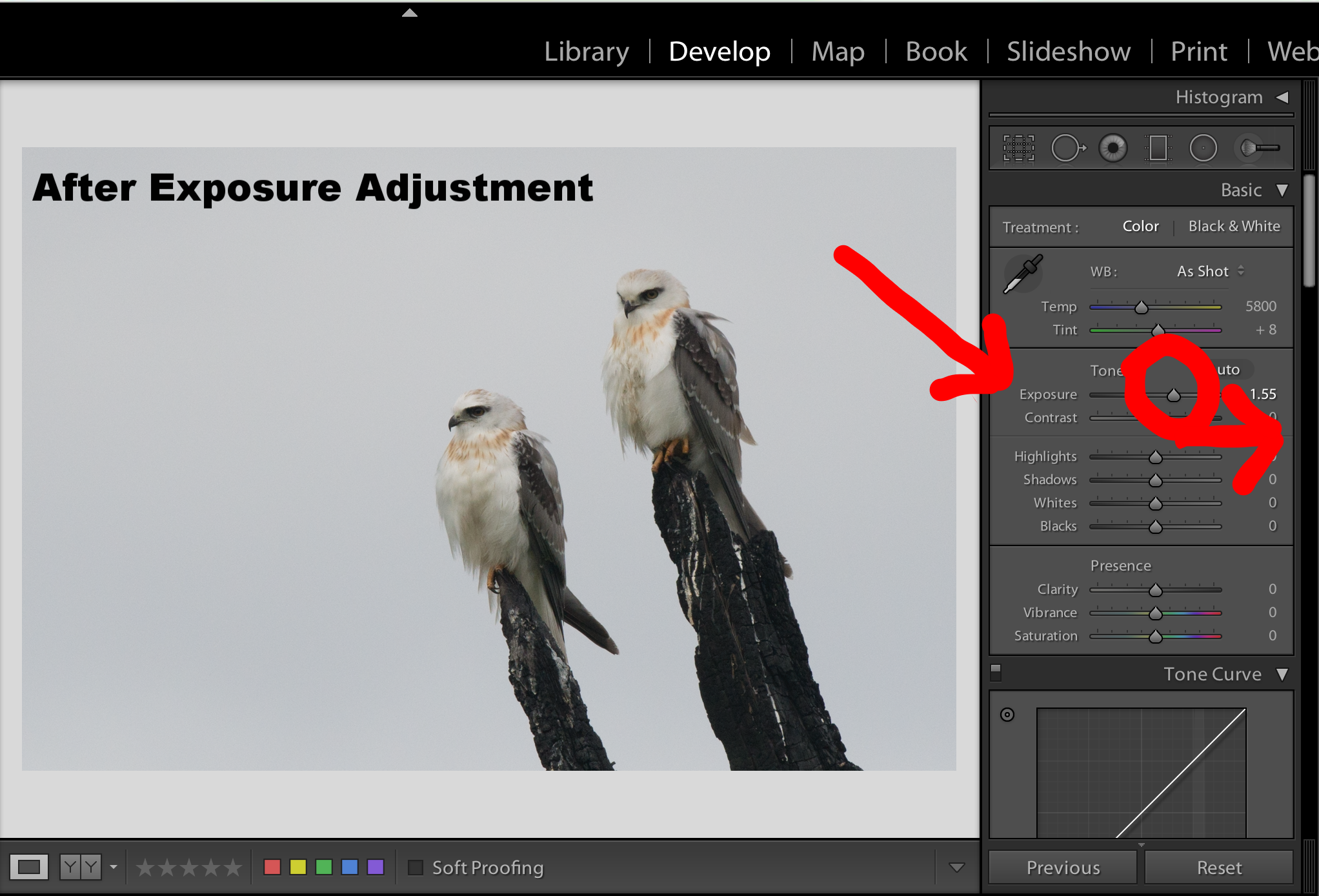
The image is underexposed. I often deliberately shoot underexposed especially when photographing white birds or trying to capture flight images where a high shutter speed is necessary. In this case it was a dark overcast day and I was using a high shutter speed in the hope of capturing a takeoff shot. Given that the birds were perched and I should have taken a few shots with a lower shutter speed to give me a better exposure but, at the time I was so focussed on capturing a takeoff shot that I didn’t think of it. I find images can be lightened up quite successfully in Lightroom, however it is important to remember that whenever exposure is increased so is noise. The good news is that noise can also be reduced quite successfully as you will see in the next steps. Adjusting exposure in Lightroom is easy, simply slide the exposure bar to the left or right until you are happy with the result.
5. Decrease Shadow
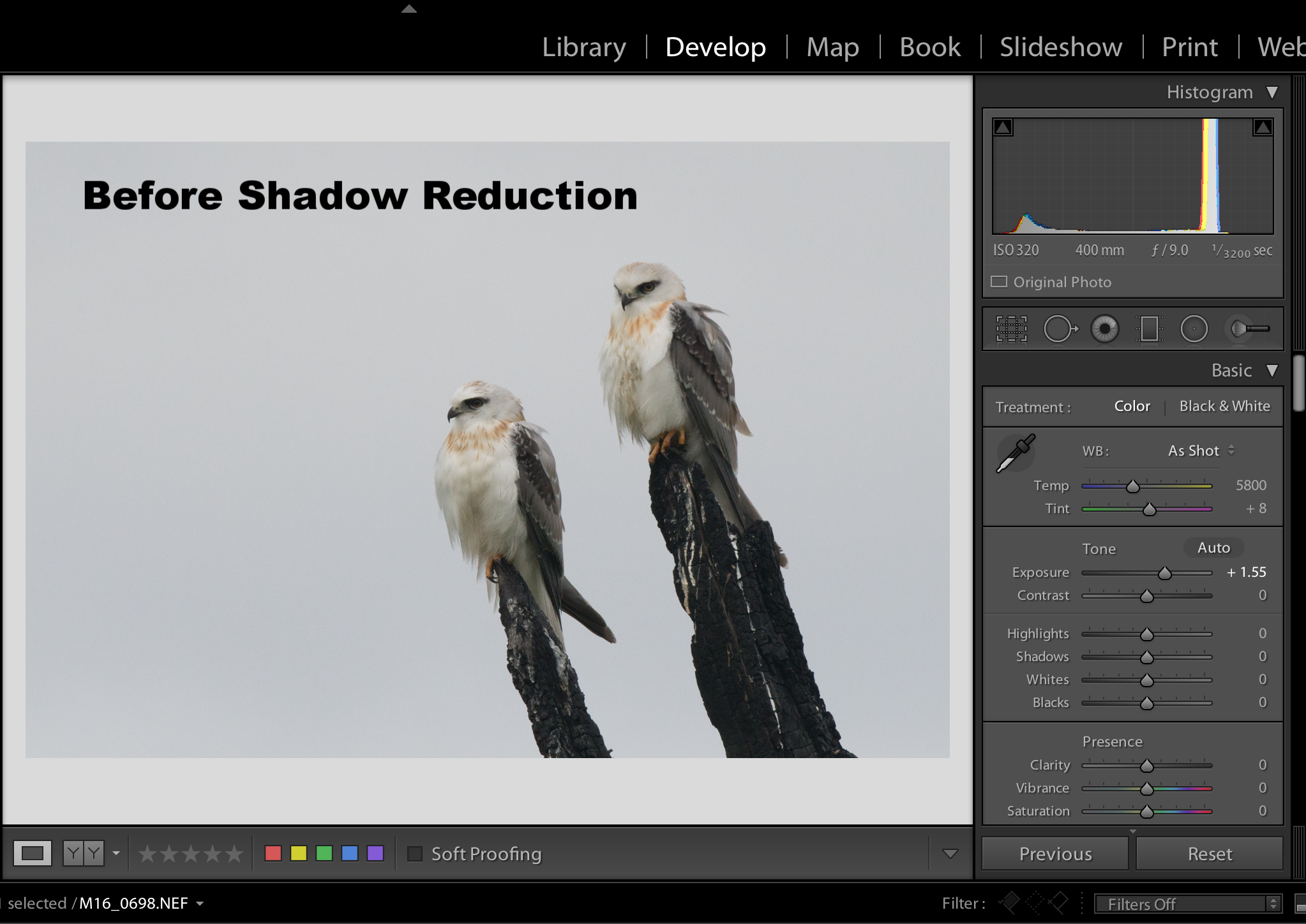
Adjusting the amount of shadow in an image is another way of lightening it up. If a subject is in deep shadow a slight adjustment to this setting can make the image workable. In this case it makes a very slight improvement.
6. Adjust Contrast and Whites and Blacks
Contrast
I often increase the contrast in my images. I find it tends to make images more powerful and defined. It is something worth playing around with, however I have found that less is often more with contrast. Too much and an image starts to look artificial and a bit weird. As a side note, I have found that extreme increases in contrast can work really well with monochrome images so that is something worth experimenting with. In this case I increase contrast to 14 (out of a possible 100)
Blacks/Whites
Adjusting the intensity of Blacks and Whites in an image is another way of adjusting contrast with a finer level of control. In Lightroom there is an adjustment bar for whites and another for blacks. It is interesting to play around with the effect of these adjustments. I often find that a small increase or decrease in either can make a dramatic difference to the quality and oomph of an image. I rarely adjust whites in my images however this image has a light and somewhat dirty looking background. By increasing whites dramatically to 42, the image is lightened up a bit more and the murky tone of the background is cleared to give the imager cleaner appearance.
Conversely, I almost always adjust blacks in my images, but usually only slightly. I find an increase in black tends to make images appear more powerful and defined. In this case I heavily increase the blacks to 33 to make the subject stand out from the pale background and increase definition in the feather detail.
.
7. Adjust Clarity
Clarity adjustment is one way to sharpen an image in Lightroom. It works by increasing the contrast in the mid-tones of an image which bring out the detail and texture and increase the apparent sharpness. I almost always use a slight clarity adjustment when processing my images. In this case I have increased clarity to 18. When you compare the before and after images below you can see that the effect is subtle however, if you look carefully at edges and lines within the image you will see that they are harder and sharper after clarity is increased.
8. Adjust Vibrance and Saturation
Vibrance
The vibrance tool works to boost the saturation of muted colours in an image. Vibrance only effects the mid-tones of an image and consequently, it is a very useful way of increasing colour without getting an un.realistic, over saturated effect. In this case I have increased vibrance to 9.
Saturation
I usually tend to be quite conservative when it comes to saturation. To me images that are over saturated look artificial and I prefer images to reflect reality. Consequently, I tend to use the vibrance tool a lot more than the saturation tool to increase colour. However, this image has very little colour, apart from the orange brown feathers, eyes and feet of the birds, so an increase in saturation will have a significant increase on the impact of the overall image. With this in mind I increase the overall saturation to 10 and selectively increase the saturation of orange to 13. These adjustments make those little splashes of colour really stand out. It does look a little unrealistic, however my aim in this process is to produce an image that grabs attention, evokes a story and is hopefully good enough to print so I am willing to use a degree of creativity in my process.
9. Sharpening and Noise Reduction
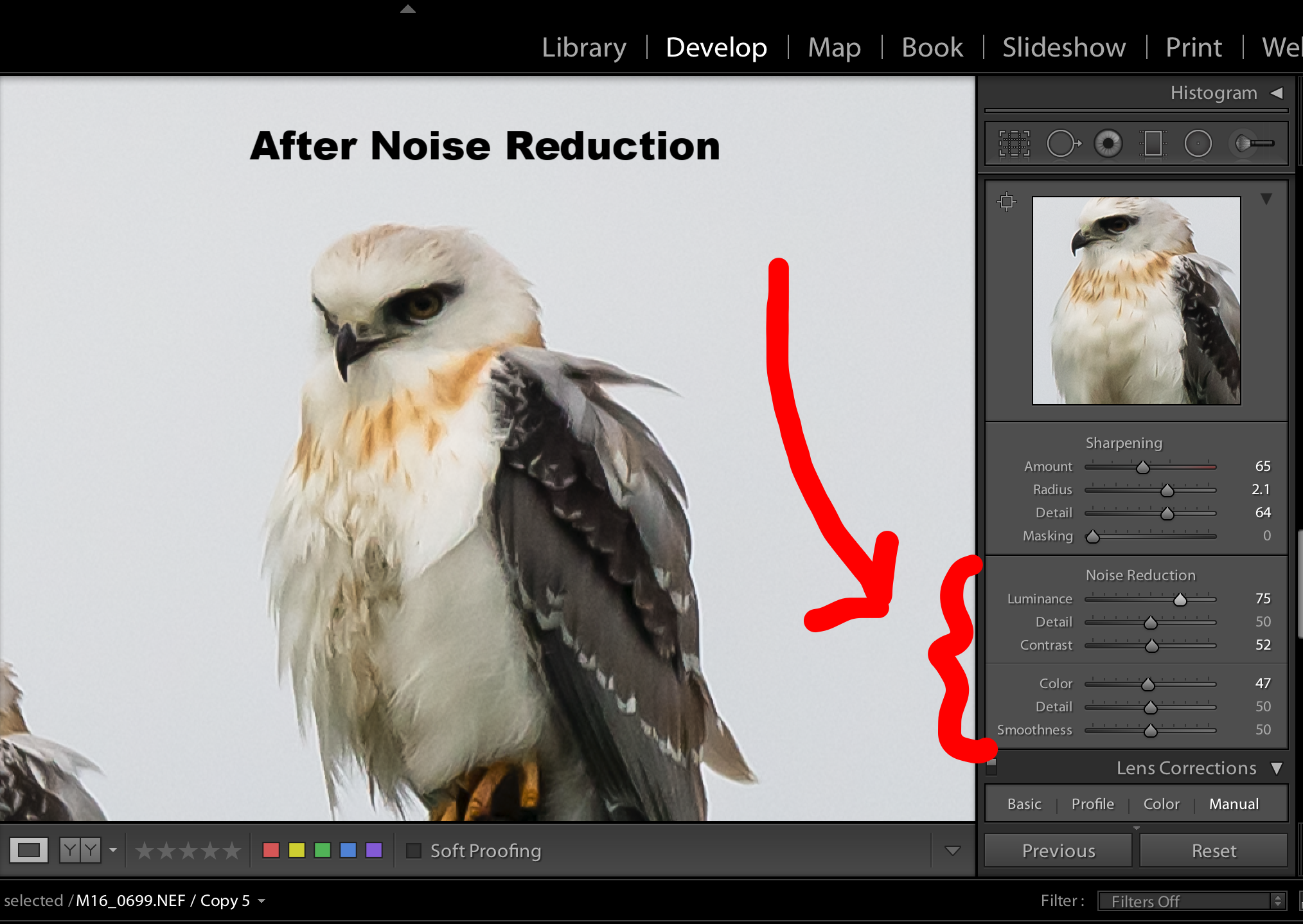
The quality of this image is not great. It is not perfectly sharp, my subjects were too far off and were quite underexposed. When you zoom in on the detail it is soft. I sharpen most of my images to varying degrees depending on the quality of the original capture and the effect I am trying to achieve. In this case I sharpen it quite a bit by moving the sharpening sliders to the right. In Lightroom a closeup thumbnail of your image appears above the sharpening slider bars so you can see the effect your adjustments are having. Sharpening is a complex, technical topic, so please bear in mind that this is an extremely simple overview. There are four slider bars which control sharpening.
Amount Slider
The amount slider controls the overall degree of sharpening in a broad sense. It works by increasing the amount of contrast between different pixels in a general way. In this case I have moved the amount slider to the right to a value of 65. It is quite a heavy effect which can be seen clearly in the thumbnail image as the bar is moved.
Radius Slider
The radius slider is a more intricate adjustment. It controls how far the sharpening effect extends from the centre of each pixel. A smaller radius results in a softer effect while a larger radius produces a sharper, harder edge effect. In this case I have moved the radius slider to the right to obtain a harder effect at a value of 2.1.
Detail Slider
The detail slider is another intricate adjustment. It effects how the high frequency data is displayed and works to increase texture and finer detail. In this case I have moved the detail slider to the right to a value of 64. This is something I tend to play around with in most of my images. It is easy to over sharpen an image, resulting in an overly hard edged effect which gives the overall image an unrealistic, sometimes weird appearance. I find this is particularly relevant to images with fine details such as grass or feathers. Too much sharpening and feathers lose their soft appearance and just look hard and fake.
Masking Slider
The masking slider is another intricate way of controlling the sharpening process. This adjustment effects which pixels are sharpened and consequently, allows you to control where the sharpening is occurring within the image. If the masking slider is moved to the far left everything will be sharpened. As the slider is moved to the right, softer edges will be increasingly ignored. At the far right only the hardest, most prominent edges are sharpened. The more the slider is moved to the right the softer the overall effect and conversely the further to the left the harder and sharper the effect. This tool can be very effective when you are trying to maintain a soft background yet sharpen your subject. In this case I have the slider set to the far left as I am trying to get the image as sharp as possible.
Noise Reduction
Noise comes in two types, colour noise and luminance noise. Colour noise is evidenced by multicoloured pixels in an area where colour should be uniform. Luminance noise is monochromatic so appears as grain. Noise removal is another complex technical topic so once again rather than get into technicalities I am simply going to detail my process. Noise is created in images taken at a high ISO, it also increases in processing when you increase exposure and sharpen images. When images are imported into Lightroom the software automatically applies a degree of noise reduction, which can be seen by the positioning of the noise slider bars. The first step in correcting noise is to ascertain the type of noise in your image and then adjust the appropriate slider bars. It is easy to visualise the effect of your adjustments by looking at the magnified thumbnail image above the slider bars. I tend to use this as my main guide in deciding on final settings and in this case I have moved all bars into the middle to achieve what I thought was the best effect. It is worth remembering that noise reduction comes at the cost of detail. As noise is reduced, detail is lost and images can take on an overly smoothed out, fake appearance. Additionally, for me, optimal noise adjustments depend a lot on the image and the effect you are trying to achieve. In some images, a grainy, noisy effect works really well and enhances the atmosphere and evokes emotion. I find this is often the case with black and white images, particularly portraits. In other images a smoother low noise effect creates a clean, airy kind of feel to the image.
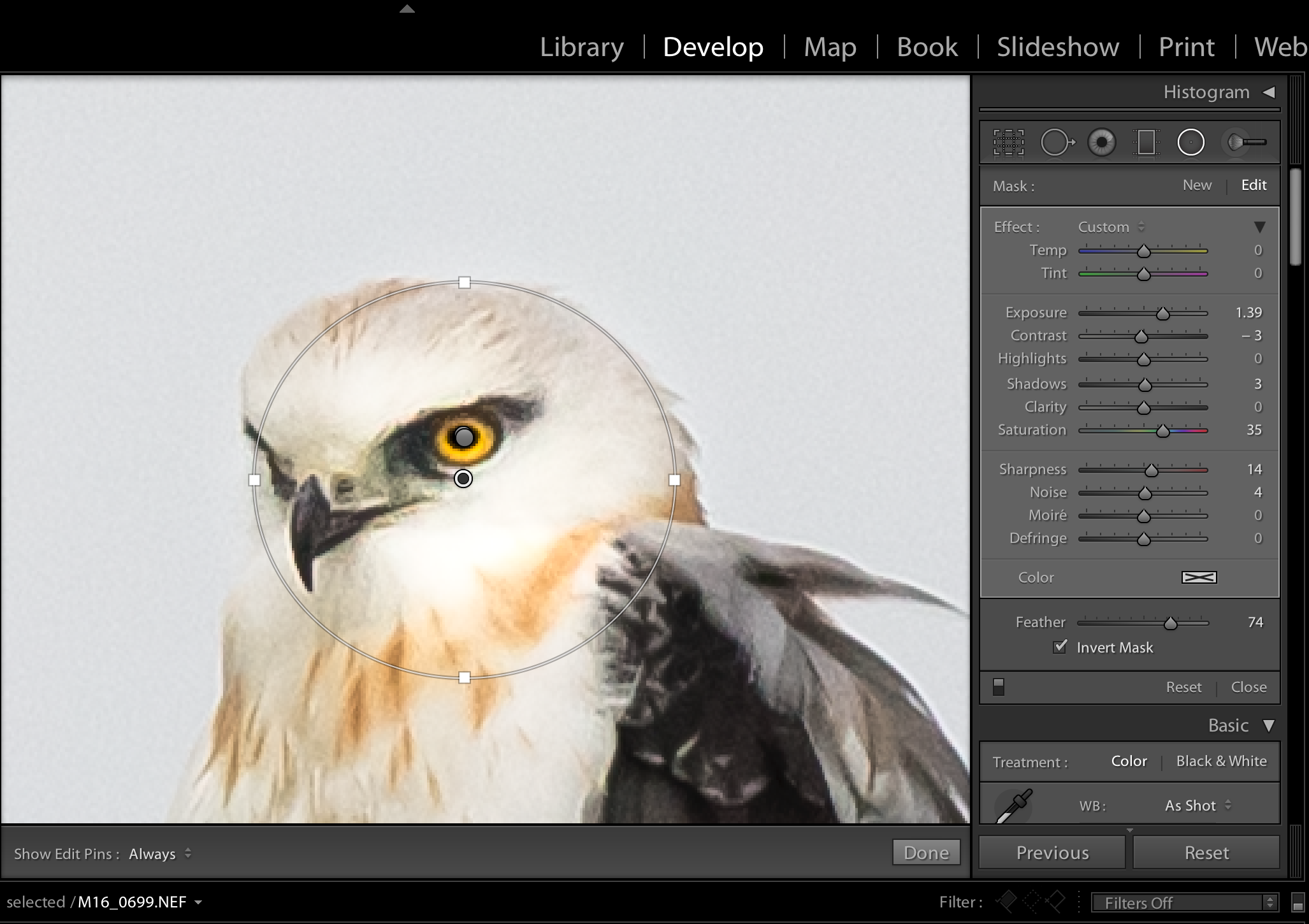
10. Use the Radial Filter to Selectively Adjust the Face and Eyes
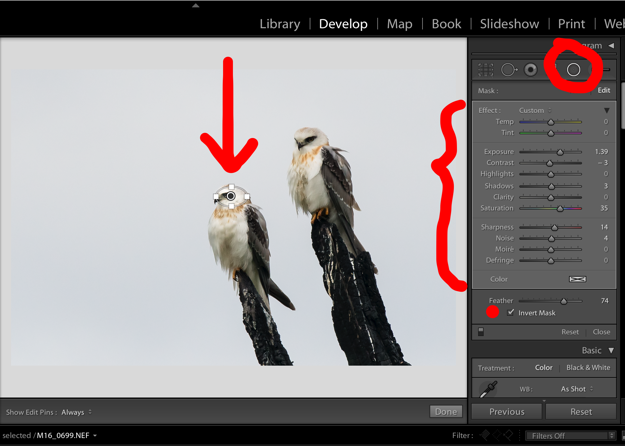
One of the most useful tools in Lightroom are the local adjustment tools. The radial filter is a tool which allows you to select an area of the image and selectively apply all of the basic lightroom adjustments to the area inside or outside your selection. The application of this adjustment can be feathered so the changes appear natural and blend in to the overall image. In this image, the face and more importantly, the eyes of both birds are dark and in shadow. The radial filter can be used to lighten, brighten and sharpen these small areas, independent to the entire image.
Capturing a sharp clear eye is probably the thing I consider most important in my bird photography work. In most cases, our eye is automatically drawn straight to the eye of the subject. Consequently, if your subject’s eye is blurred, soft, dull or in shadow a great deal of initial impact is lost, reducing the effectiveness and appeal of what could otherwise be an outstanding capture. In this case the quality of the image is not great to start with and it is not possible to retrieve enough detail to create a competition winning, technically great image. However, it is always worth playing around with these things, and in this case, it is possible to create a useable, printable image.
Use the Radial Filter to Lighten the Face
My first step in local adjustment process is to lighten, sharpen and increase the saturation of the face of one subject. I use the radial filter to encircle the area I want to adjust, ensure that the invert mask box is ticked (so that adjustments apply to the inside of the filter circle), and then increase the exposure saturation and sharpness.
Use the Radial Filter to Darken the Pupil of the Eye
The next step is to zoom in on the eye. You will note that the image starts to pixellate at this level of detail, which again tells me that it is not a great quality image. That aside, I use the radial filter to encircle the pupil of the eye and adjust the settings to dramatically darken this area.
Use the Radial Filter to Lighten and Saturate the Iris of the Eye
Still zoomed in on the eye, I create another radial filter and encircle the iris of the eye. Once in place, I adjust the setting to lighten and saturate this area. I have chosen a fairly extreme adjustment in this case. It does look a bit fake, however I am trying to highlight the small splashes of orange in the image. The colour of the eyes, ties to the colour of the orange brown feathers and also the feet of my subjects, so I am prepared to accept a degree of unrealism to highlight this aspect of the image.
Use the Radial Filter to Repeat the Process on the Second Subject
Use the Radial Filter to Increase the Saturation of the Chest Feathers on Both Subjects
11. Use the Adjustment Brush to Lighten and Saturate the Feet
The adjustment brush works in a similar way to the radial filter but instead of defining an enclosed circular area you use it to paint like a brush. It is excellent for selectively adjusting small, irregular areas to increase, exposure, saturation, contrast or sharpness. The size of the brush, the degree of feathering and the flow rate can all be adjusted to suit the situation, giving you an extremely powerful, versatile tool. In this case I brush over the feet, increasing exposure, saturation and sharpness.
12. Final Crop
I decided on a final crop using a 4*6 aspect ratio. Why? I like the sense of space to the left of the birds. Both of the subjects are angled to the left so to me it gives the sense that they are contemplating the space and I really like the composition. Also, given the less than perfect quality of this image, I do not want to crop in too close. A more distant crop has the double advantage of creating a sense of space and disguising the problems and poor quality of the image.
13. The Final Image
I am happy with the end result of my processing. The final image is a reminder of the day I captured the image, it evokes a story, captures a rare moment in bird photography and highlights the beauty of these gorgeous babies, sitting in their soggy waterlogged paddock on a bleak gray day. The image could probably be improved further with more knowledge, expertise and time. In any event it is one of my favourites. I love the subtle colours and the sense of naivety and innocence evoked by their soft white feathers and curious knowing eyes. I wanted to see it on the wall, so I had it printed at a size of 12*15 inches (8*10 aspect ratio) on fine art textured paper and named it 'Double Trouble'. I find that heavily textured paper is more forgiving of poorer quality images and can work to enhance the atmosphere and feel of an image. In this case the choice of textured paper worked really well and the image printed up beautifully. I had it framed with a simple black frame and matt board. Unexpectedly, it is one of the images that I have sold, to a lady that loves raptors and saw it on posted facebook.
I do not usually process my images to the extent detailed above, and, it is not something I want to be doing on a regular basis. I prefer to capture higher quality images in the first place by using appropriate settings and good shooting techniques. However, perfection is rare in life and processing this image turned out to be a very interesting exercise. Primarily, it has given me an illustration of what is possible with processing and shown me the extent to which an image can be rescued. I am far less likely to discard a poorer quality image at first sight and am definitely inspired to learn more about Lightroom and improve my processing knowledge and technique. As a final bonus, I have a gorgeous framed print of two baby Black Shouldered Kites to hang on my wall.
